
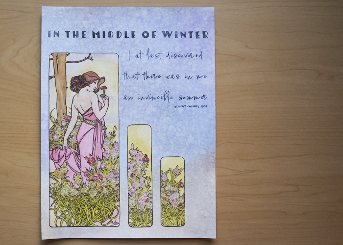
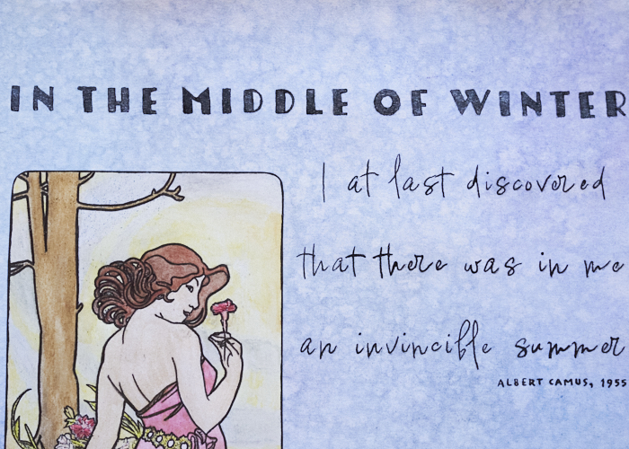
Over Thanksgiving, I bought two large ink prints with ideas to dazzle them up with embroidery. It felt daunting because I only have a single copy of each and I love them, so I don’t want to screw them up. While looking for a watercoloring tutorial book I have by Stephanie Pui-Mun Law to get into my mixed media practice, I first came across a coloring book I picked up when the Speed Art Museum in Louisville hosted an Alphonse Mucha exhibit. Mucha is one of my favorite artists, so immediately I was derailed and just had to do something with it. This one is titled The Flowers: Carnation, from 1898.
My first question was: could I take a photo of the page and print it using my toner-jet printer for watercoloring, or would the toner be water soluble? Toner is waterproof, tada! Then I colored it with watercoloring pencils and painstakingly added water.
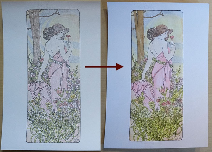
My toner is nearly out, so I reinforced the lines with a black marker of an unknown brand (and discovered later it was not waterproof so I had to be very careful when I did final touchups anywhere).
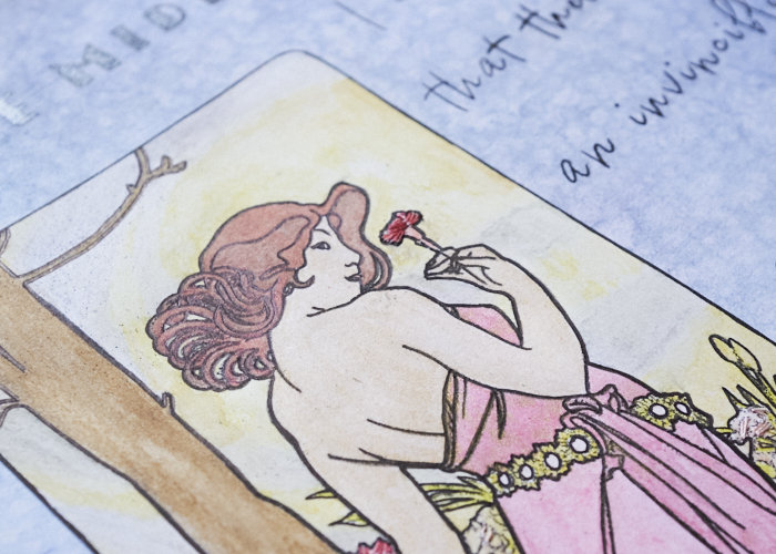
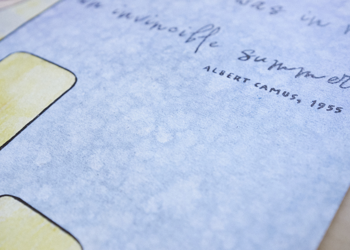
Around this time, I had the idea to cut her out and mount her to a larger sheet. When I thought about some of my favorite quotes, I came to Albert Camus’s oft-misquoted passage from an essay in his Myth of Sisyphus and Other Essays (1955) publication. Camus‘s absurdism resonates with me quite a lot at times, so you might call him one of my favorite philosophers. Because of the quote, I wanted her to stand out more among the flowers, so I carefully went back with some sparkly paint and added a sheer touch of glam to the figure. Of course, this never looks as wonderful in photography as in real life.
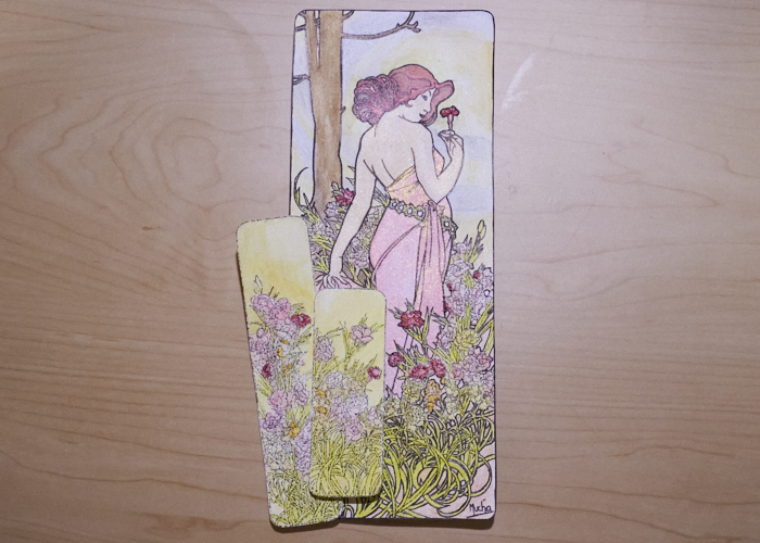
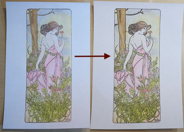
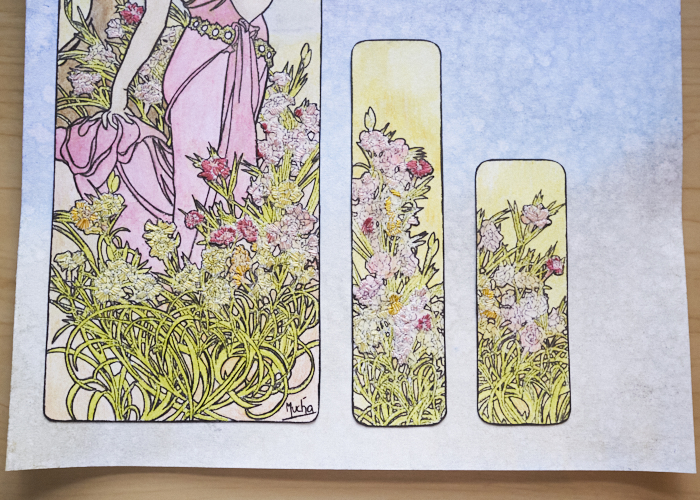
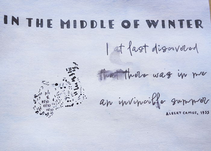
You can see that I also added two little vignettes that weren’t included in the coloring book. I just used photoshop to create them, then printed, colored, and painted the same way. In the above photo, you can see how important it was to then outline everything sharply in black, as Mucha’s linework is just about the most fantastical part of his work. That photo also shows I had begun adding embroidery, too. Let’s look at that more closely!
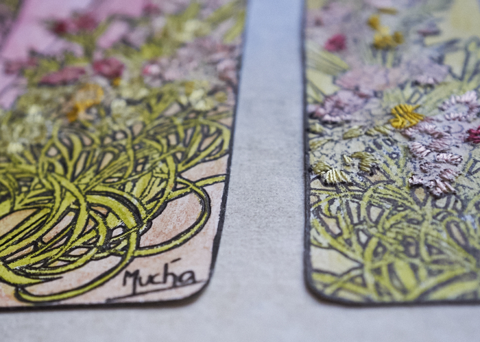
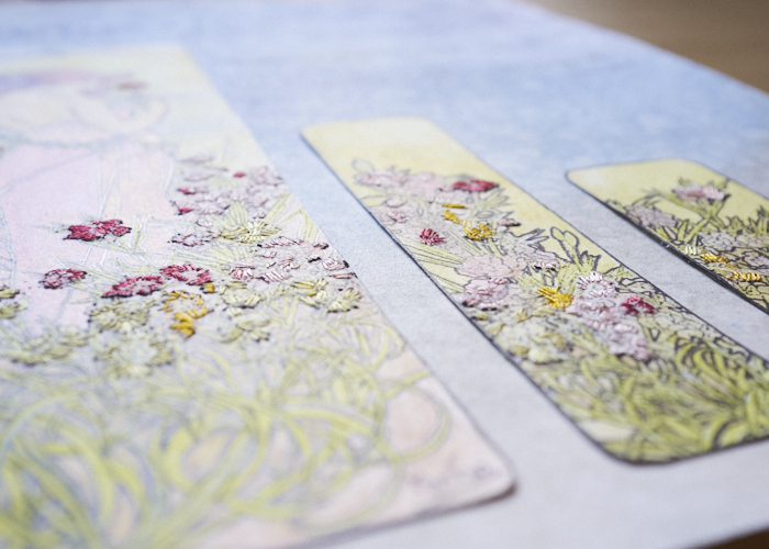
It is really just a matter of a few straight stitches here and there. I’d say it is so subtle, it almost wasn’t worth it, but altogether at the end, the textural difference in the way light hits it in real life is quite lovely.
I especially like how the carnation she is holding stands out so clearly with the thread.
I’m really pleased with how I added those two other rectangles. I think they suit Mucha’s style quite well, and nicely balanced out the whole piece.
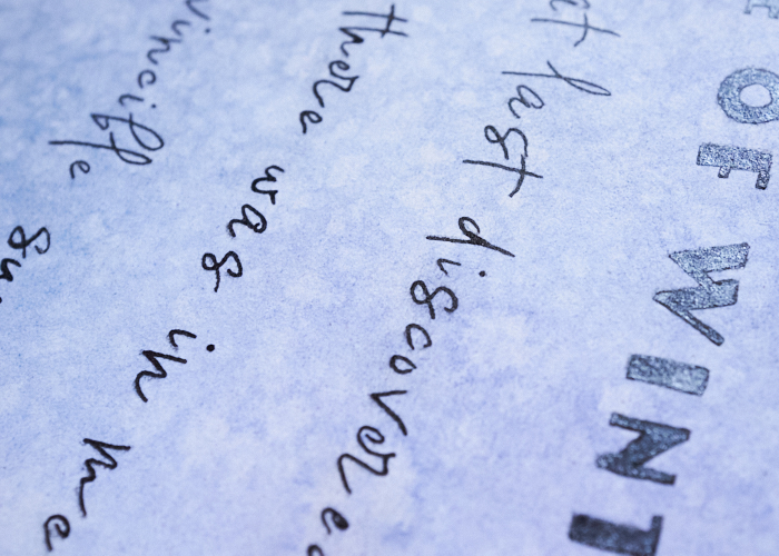
The whole quote reads, “In the middle of winter I at last discovered that there was in me an invincible summer.” I printed this out after designing it in photoshop using a combination of Tomarik Display font for the first line and Lindsey Signature font (with stroke added) for the rest. Then I traced it with my light table and filled it in with my calligraphy pen skills dating to my high school days. Nevermind the slightly uneven line weights – I am satisfied enough with it. The main sentence is also painted with a shimmery pewter wash for a bit of sparkle.
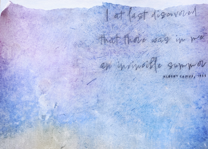
The text part of the project nearly drove me bonkers, but it is better for it. The next image was the original backdrop. The paper wasn’t laying flat as I hadn’t first covered it in gesso yet, so I gently sprayed the back with water and weighed it down. The water came through to the front, and ruined the quote since the marker I had original used was not waterproof. I was quite peeved at this, but it later became my test paper, hence all the little scratchy marks.
Next, I used my India ink and quill pen as I had discovered that this combo was perfectly waterproof. Then I colored the page and added water. Everything was so nice, except I didn’t like the colors themselves – a little too vibrant for what I wanted. I decided to add a layer of gesso and then color and wash again. In adding the gesso, I discovered the India ink smeared everywhere, not to mention I chose a raggedy brush and bristles were left every which way. Disappointed was an understatement.
Next, I painted the gesso first before adding ink. I was originally afraid to do this because of the tooth; I thought it might not work well for the quill nib, but it was fine. However, my quill pen sometimes was loaded with too much ink, and I didn’t like that “l” in invincible whatsoever. I decided to try again. This page therefore became a test of its own.
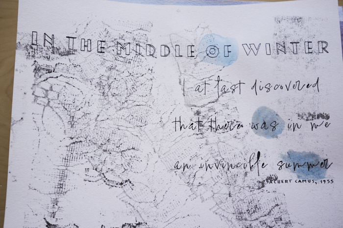
And here it was that I learned if I painted a piece of lace, then used my brayer, it made a lovely stamp. That’s been noted!
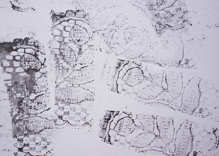
So, when I tried yet another time, I chose more carefully the colors and how much pigment I laid on the page. I also realized my initial fear of not being able to see through a painted sheet to trace the letterings was false – I could see just fine through the original, so I opted to add letters after coloring the page and therefore avoid any potentiality of smear.
I also found accidentally that by spraying my little bottle oh-so-gently, I could get a cool splotchy effect. All in all, my mistakes made the project better. India ink stands out so sharply compared to a marker. And the background is so much more lovely than where I started.
Now I just need to decide on a frame!


0 Comments