
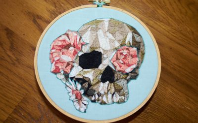
A few years back, my uncle introduced me to the Lake coloring app, and I was hooked for a while. I really loved the artwork by Nina Stajner and took a screen shot of one of her pieces so I could “color” it with thread some day. But it was one of those vague “some days” until I came across Tanya Bentham’s opusanglicanum blog. She does really fun embroideries based on medieval work. (I especially enjoyed seeing her progress of Three Living and Three Dead.) The technique of how to render a face in flat stitching that is reminiscent of 3D shape interested me a lot – you can see what I mean clearly in the face of Queenie.
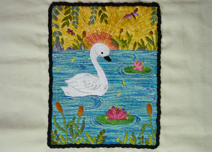
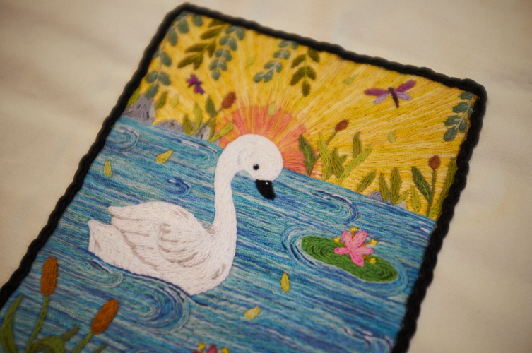
I wanted to try this, and the cute swan gave me the perfect excuse. Although I knew it would eat up a lot of thread, I chose my favorite stem stitch to model the entire thing. For my first go at this sort of technique, I don’t think I did too poorly. I used two weights of interfacing to give it a little more ground, and worked it on a fairly tight and thin off-white canvas-like material (I would really benefit from understanding different fabrics some day!). The stitching itself gives it some rigidity which feels really nice in the hand.
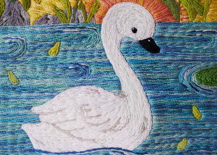
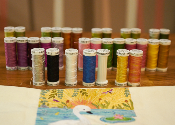
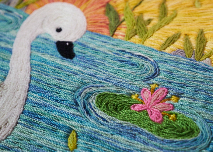
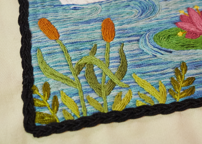
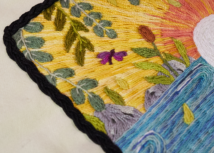
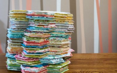
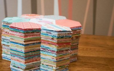
When I set out, I suspected that this would only involve a handful of colors. Gee, was I ever wrong! When I get a case of the crafties, all sense of orderliness is tossed aside and pure chaos reigns, so I could see the pile of thread colors stacking up in my working box. Here are all of them – you can see at this stage, I had run out of the watery blue, but the rest was completed. In the front row, we see that the swan used the grey, black, and white. The water used the white, blue, and (empty) variegated blue. The sky used the variegated yellow, and the sun used the variegated orange. In the second row, we see that the large dragon fly used two purples on the left, sharing the body color next with the smaller dragonfly, that used the next two purples. Then, we have the small lilly pad pinks, sharing two greens with the larger lilly pad, who had deeper pinks, and both using gold and brown for their little fronds. The back row highlights the groups of greens and browns used on all the other plants. The only spools not shown here are the three greys I used for the rocks (these are with another WIP and I returned them to that working box, so they slipped my mind for the photo). That makes a total of 35 colors! Hot dog, that’s a lot!
One of the things I learned with this project is that very color selection process. I wanted the shadows to not be too dramatic, but in some instances, the colors were a tad too close together to show each other off. I think this is most evident with the lily pad flowers, as the two are not the same. But, unless they were right next to each other, I don’t think this can be seen.
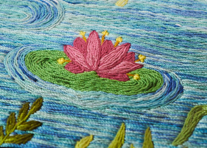
I did try to make the back row of plants the darker shade with highlights, while the front row of plants are in light shades with lowlights. I think that subtlety works nicely. By that, I mean that you can see with the front row of plants, I used the darker greens to “push” things into the background. And then on the back row of plants, I used the lighter greens to “pull” things more into the foreground. It’s similar to the technique I used on the lily pads’ shadowing, if you look closely.
I also want to point out how cool those rocks look. I wasn’t sure how to pull it off, without them simply looking like blank grey spaces. I made a decision on approaching them with angle lines, and using both a shadow and highlight color in different areas. I was pleasantly surprised when you don’t even have to squint to see the rocks three-dimensionally!
Except for solid white and solid blue highlights in the water, I strictly used Sulky’s variegated blue color for the little pond. (Most of the photos have water in them, so here’s another look at that nifty rocky row instead!)
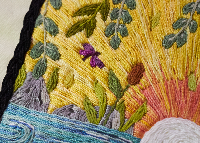
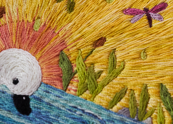
For the sky, I used a variegated orange for the sun, and a variegated yellow for the rest. I love the variations of these threads because the variation is a hue range, rather than changing to a totally different color. It’s more nuanced that way than some of the other variations. I tried blending the sun and sky together with a few wayward threads into and outside of the sun’s outline. I didn’t want there to be a hard and fast line at the sun’s edge (which I thought would look too much like a halo for the swan). In hindsight, I would not do this again, or I would do it with more regularity. From afar, it looks decent enough, but up close, to me, it looks like mistakes. And it still looks a bit too halo-ish. The sun is also something I added that Nina did not have included on the coloring page. I chose to do this because I wanted the angle of the yellow stitching to be different than the horizontal lines of the water. Vertical lines for a sky wouldn’t make any sense, so the perspective angle came to mind. Thus, a sun was born.
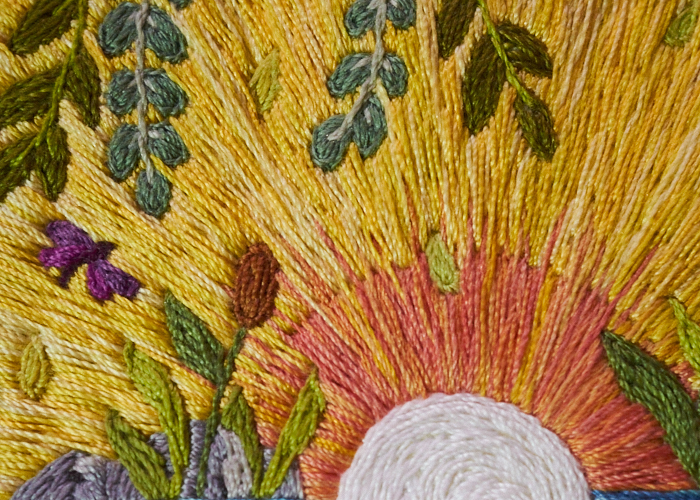
I wanted the dragonflies to pop, and so thinking about the color wheel, I chose purples to stand out from the yellows. The dragonflies were a little difficult, given their scale and the thread weight / stitch combination I was using. The same is true for the tiny falling leaves. Overall, though, not bad!
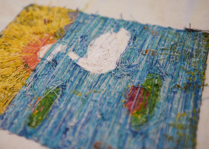
This project worked so nicely for travel and work breaks. It needed very little supplies, used a meditative simple stitch, and I could listen to a book or watch a show or hold a conversation whilst working it up. It is a LOT of stitches, though, and took much much longer than I would have ever guessed, too! I kinda fell in love with it, I admit, and thought back to how Stitch Club has taught me to try painting with thread (such as Emily Tull’s workshop). I don’t really have the time right now to try an actual thread painting project, but I do see it in my future. Some artists are simply incredible with it (just one such example is Cayce Zavaglia.) I might not like painting with paint, but I think I could get on board with painting with threads! (Incidentally, this project did almost forced me to use a thimble. My fingertip wound up hurting so much that I had to take a two week hiatus from stitching. Truth be told, it was even hard to type for a while; who knew that the pain could go deep. Another lesson learned.) But, let us recall just how much thread this sort of thing eats up by looking at the interesting backside:
This project provided a second learning experience, too. Previously, even though I had done a study on the stem stitch through TAST, I hadn’t really considered how the stem stitch and the outline stitch look different. I know they take curves differently, and sometimes I will cheat and use a combination of them for a particular curve in my surface work. I realize this is amateur, but I also think this affront to perfectionism is simply part of my style. Some people online say they are the same stitch, only worked in different ways. I can no longer agree. I think the debate exists because with floss, the stitches really do look incredibly similar, so I hadn’t paid much mind to their differences. But with a twisted thread, such as the Sulky Petites 12wt this is done in, there is a clear difference – the outline stitch rolls together quite nicely in something I would call an actual outline, while the stem stitch fills a space nicely and works beautifully as a filler. That said, I noticed this late in the game, so this swan piece uses a combination of both. If you look closely, you may be able to make out certain areas where I switched back and forth. I’ll probably still do this in the future with floss, but now when I really do want an outline, I won’t be working it in stem, and I won’t be using floss.
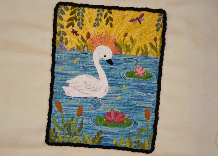
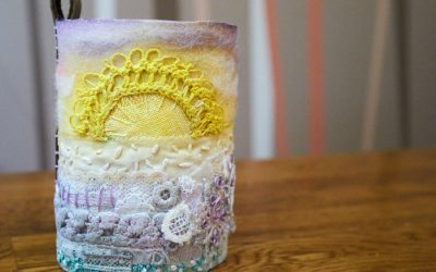
Now, when I embarked on this project, I envisioned this to be a little pouch for my kindle, just because. (I subscribe a little to the Japanese concept of zakka – loosely defined as improving anything and everything because: why not? Everything we surround ourselves with aught to bring us joy.) That’s why I outlined it in a nice black braid trim, to be framed just so on the pouch’s front, and with so much “seam allowance” all around. Boy, however, cautions me that it is “way too cool” to risk it getting dirty and believes I should frame it. I’ve set it aside for now to contemplate. If it turns into anything other than a framed piece of art, you’ll see that back here at theCrafties!
I’m not sure Nina draws up coloring pages anymore, but she did release a coloring book and has now moved into the fabric market. Uht oh! I might have to add to my stash…
UPDATE: I just realized this project kind of began back in 2019!


0 Comments